Kami紙
Good content deserves good paper. One design language across six document types: warm parchment, ink-blue accent, serif-led hierarchy, editorial whitespace.
00 · See it
Output Samples
Tell Claude what you need in plain language. It produces print-ready documents using kami's design language.
One-Pager
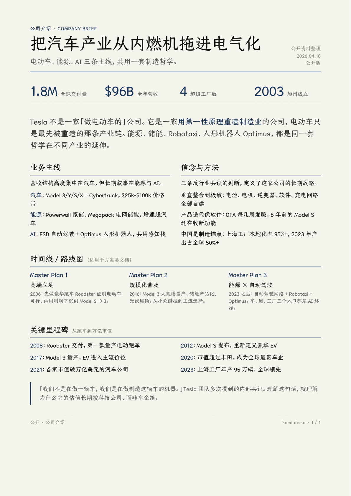
Tesla company profile, single A4
Slides
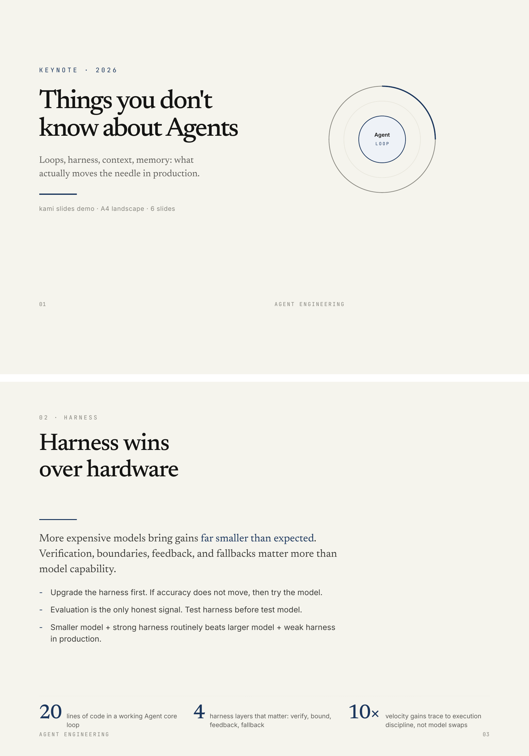
Agent keynote, 6 slides
Resume
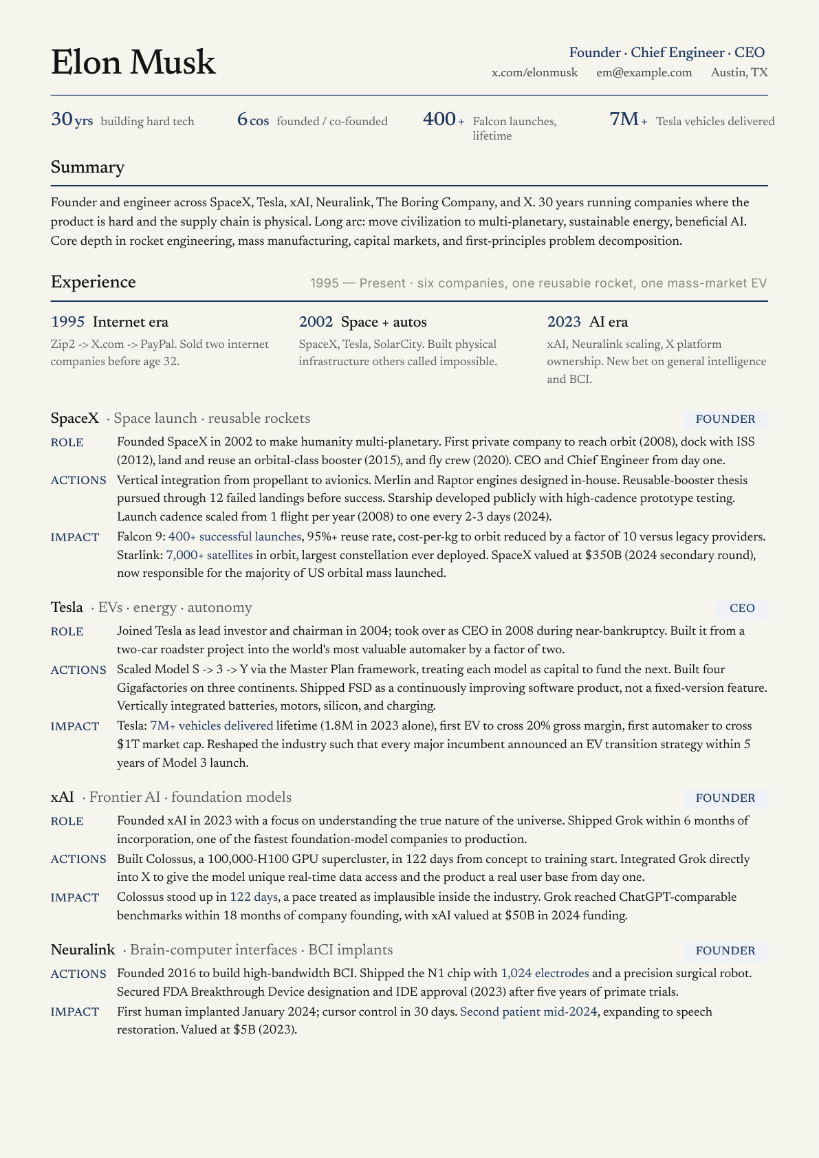
Founder CV, 2 pages strict
Portfolio
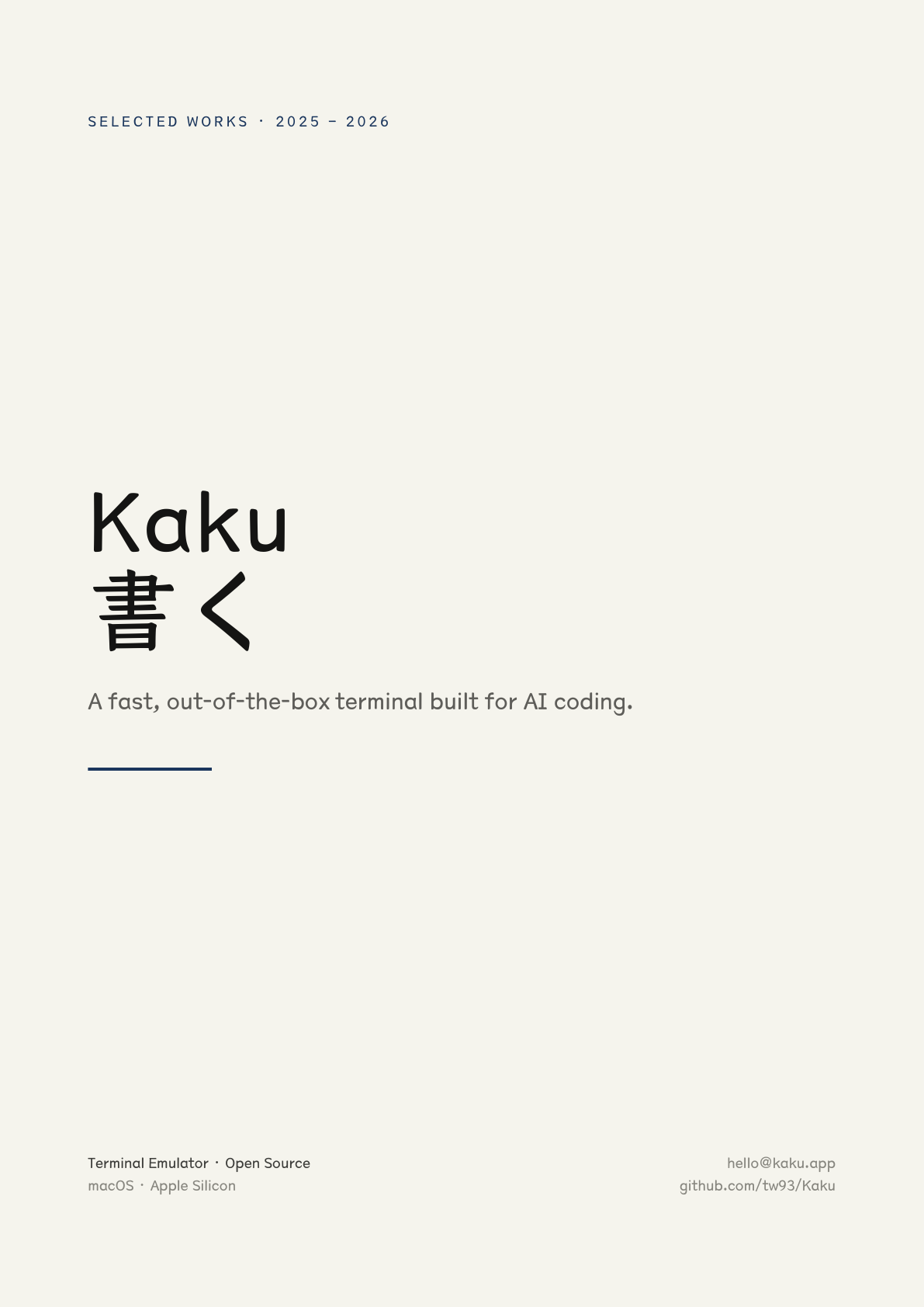
Kaku terminal, 6 pages
01 · Usage
Install & Invoke
Just tell Claude what you need: "build me a resume", "make a one-pager for my startup", "design a slide deck for my talk". The skill auto-triggers, no slash command needed.
# Claude Code
npx skills add tw93/kami -a claude-code -g -y

# Codex
npx skills add tw93/kami -a codex -g -y
02 · Manifesto
Design Manifesto
Warm parchment canvas, ink blue as the sole accent, serif carries authority, no hard shadows or flashy palettes. This is not a UI framework; it is an aesthetic constraint system for printed matter. It believes: quality documents read like literature, not dashboards.
- 1
Page background is parchment
#f5f4ed, never pure white - 2
Accent color is ink blue
#1B365Donly; no second chromatic hue - 3
All grays are warm, yellow-brown undertone; no cool blue-grays
- 4
English: serif for headlines and body. Chinese: serif headlines, sans body
- 5
Serif weight fixed at 500, never bold. Single weight is part of the design language
- 6
Three line-height bands: tight titles 1.1-1.3 / dense 1.4-1.45 / reading 1.5-1.55. Never 1.6+
- 7
Tag backgrounds must be solid hex; no rgba, WeasyPrint double-rectangle bug
- 8
Shadows: ring or whisper only, no hard drop shadows
03 · Color
Warm Restraint
One accent + warm neutrals + zero cool colors. Ink blue covers no more than 5% of any page. Beyond that is clutter, not restraint.
Canvas
Parchment
Page background, the emotional foundation
#F5F4EDIvory
Cards / elevated surfaces
#FAF9F5Warm Sand
Button default / interactive surfaces
#E8E6DCDeep Dark
Dark theme page base, not pure black
#141413Brand
Ink Blue
Primary color · CTA · section left bar
#1B365DInk Light
Links on dark surfaces · lighter variant
#2D5A8ADark Surface
Dark theme container · warm charcoal
#30302EError
Error state, deep warm red
#B53333Warm Neutrals
Near Black
#141413Dark Warm
#3D3D3ACharcoal
#4D4C48Olive
#5E5D59Stone
#87867FWarm Silver
#B0AEA5Tag Tints: rgba to solid hex
Ink Blue #1B365D layered on parchment as equivalent solid hex. Never use rgba(): WeasyPrint double-rectangle bug.
0.08
#EEF2F70.14
#E4ECF50.18
#E4ECF50.22
#D0DCE90.30
#D6E1EE04 · Typography
Type System
Serif carries authority, sans carries function. Serif weight fixed at 500: single weight is the system's signature.
Aa
Serif · Headlines + Body
Newsreader / TsangerJinKai02
All headlines, body text, pull quotes, and numeric emphasis. Fixed weight 500 for headlines, 400 for body. English uses Newsreader; Chinese uses TsangerJinKai02.
Aa
Sans · UI
Inter / Source Han Sans
Labels, buttons, metadata, eyebrows. Default 400, labels use 500-600. Chinese body text also uses sans.
</>
Mono · Code
JetBrains Mono
Code blocks, version numbers, hex values, tabular figures.
Scale (print pt; screen px = pt x 1.33)
like literature
weight 500
line 1.10
weight 500
line 1.20
weight 500
line 1.25
weight 500
line 1.30
weight 400
line 1.55
weight 400
line 1.45
weight 600
line 1.35
05 · Spacing & Shape
Rhythm & Form
Base unit: 4pt. Denser layouts get smaller margins; more formal documents get larger ones.
| Scale | Value | Use | |
|---|---|---|---|
| xs | 2-3 pt | Inline elements | |
| sm | 4-5 pt | Tag padding · tight layout | |
| md | 8-10 pt | Component internals | |
| lg | 16-20 pt | Between components · card padding | |
| xl | 24-32 pt | Section title margins | |
| 2xl | 40-60 pt | Between major sections | |
| 3xl | 80-120 pt | Between long-doc chapters |
Radii
Depth: Three Shadow Methods
Kami avoids traditional hard shadows. Depth is created through ring shadow / whisper shadow / light-dark alternation.
Ring Shadow
box-shadow: 0 0 0 1pt var(--ring-warm)
Buttons · card hover
Whisper Shadow
0 4pt 24pt rgba(0,0,0,0.05)
Gentle elevation · feature cards
Light / Dark
parchment / deep-dark
Section-level · most dramatic
06 · Components
Atomic Modules
A small, fixed set. Each answers a specific question.
Buttons
ring shadow instead of hard drop · 8pt radius
Tags, three levels
solid hex · pick from weak to strong
Quote
left 2pt brand solid + olive text
A thousand no's for every yes. Prefer clarity over decoration.
Metric
serif number + sans label · tabular-nums
Section Title
serif 500 + 2.5pt brand left bar with breathing room
Dash List
dash instead of bullet · more literary
- Warm parchment, never pure white
- Ink blue accent, no second color
- Serif carries authority
Code Block
ivory bg + 0.5pt border + 6pt radius
/* section title */
.section-title {
  font-family: serif;
  font-weight: 500;
  border-left: 2.5pt solid
    var(--brand);
  padding-left: 8pt;
}
Featured Card
whisper shadow + 16pt radius
Tesla Company Profile · One-Pager
Single A4 page · 4 metric cards + 3 body sections + timeline
07 · Decision Lookup
Quick Reference
When in doubt about what to use, consult this table. If it's not here, go back to first principles.
| Task | How |
|---|---|
| Large headline | serif 500, size by hierarchy, line-height 1.10-1.30 |
| Reading body | serif 400, 9.5-10 pt, line-height 1.55 |
| Emphasize a number | color: var(--brand), not bold |
| Separate two sections | 2.5pt brand left bar, or 0.5pt warm-gray dashed |
| Quote someone | Left 2pt brand solid + olive text |
| Show code | Ivory bg + 0.5pt border + 6pt radius + mono font |
| Primary vs secondary | Primary: brand fill + ivory text; Secondary: warm-sand + charcoal |
| Mark a special card | border: 0.5pt solid var(--brand) or border-left: 3pt |
| Begin a section | Serif title + 2.5pt brand left bar |
| Document cover | Single page, Display size + right-aligned author/date + generous whitespace |
| Data card | Ivory bg + 8pt radius + serif large number, ink blue + sans small label |
08 · Anti-Patterns
What to Avoid
Before breaking a rule, make sure you truly intend to.
Don't
Use #ffffff pure white or #f3f4f6 cool gray as page background. Kami's emotional foundation is warm parchment.
Do
Always use #f5f4ed parchment. Set @page background to the same color to avoid white edges when printing.
Don't
Use rgba(27,54,93,0.18) for tags. WeasyPrint renders padding and glyph areas at different opacity, creating double rectangles.
Do
Use the tint lookup table for equivalent solid hex #E4ECF5. Bug gone, color consistent.
Don't
Set headlines to font-weight: 700 bold. Serif 500 is the system's signature; bold makes the layout feel restless.
Do
Keep serif at 500. For stronger presence, increase size or add a brand left bar. Never go bold.
Don't
Use hard drop shadow 0 2px 8px rgba(0,0,0,0.3). Cold, SaaS-like, prints as dark blobs.
Do
Ring shadow 0 0 0 1pt or whisper rgba 0.05, or simply alternate light and dark sections.
09 · Background
Design Origins
I invest in US equities and regularly ask AI to generate analysis reports. The output always looked like a default Google Doc: bland, inconsistent, forgettable. I can't stand ugly documents, especially when every report comes out looking different from the last one. So I kept tweaking the typography, colors, and spacing until I had something I actually wanted to read.
Then I was invited to present a talk and needed a slide deck that matched the same standard. That round pushed the system further, adding inline SVG diagrams, a consistent warm palette, and tighter editorial rhythm. Eventually it was doing enough that I pulled it into its own package. That became kami: one visual language I like, applied to everything I ship.