Kami紙
Good content deserves good paper. Kami helps AI agents create readable documents and landing pages.
Output Samples
Ask Claude for a one-pager, report, letter, portfolio, resume, or slide deck. You can also use the same instructions with AI image tools; the README includes prompts and examples.
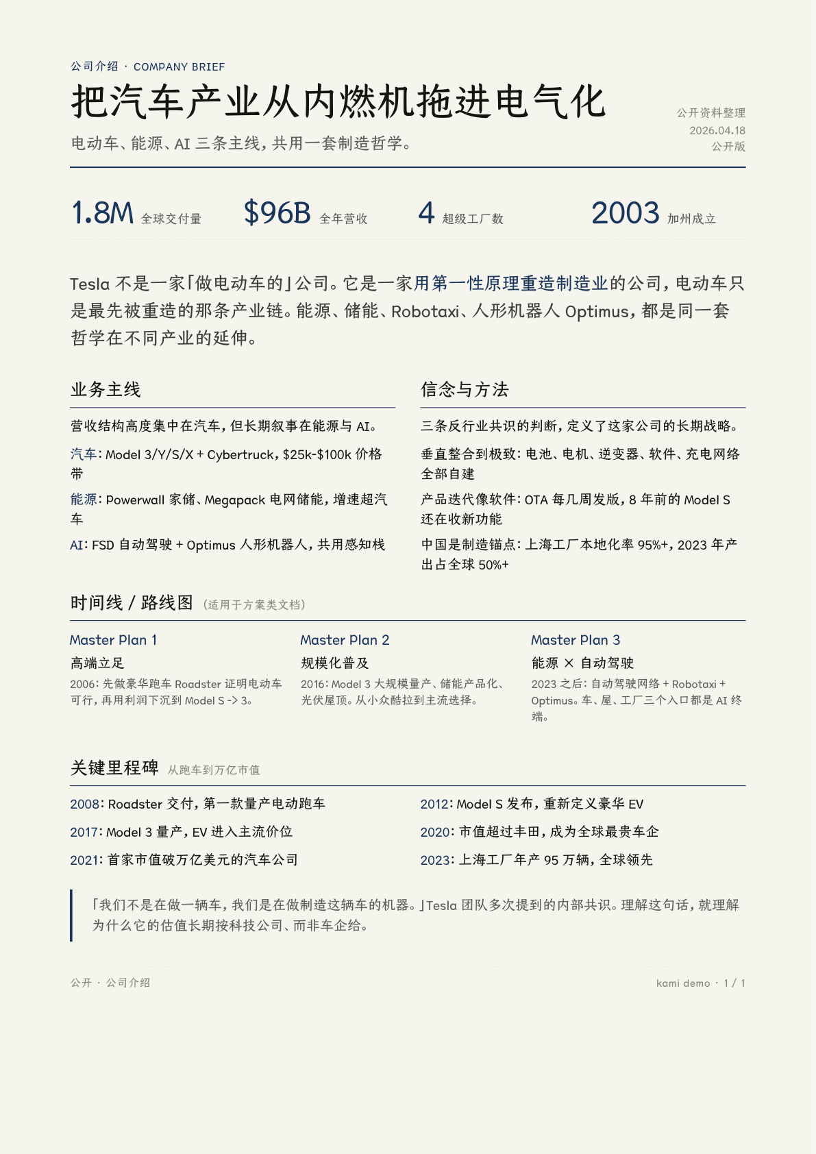
Equity Report
Tesla Q1 2026 earnings analysis
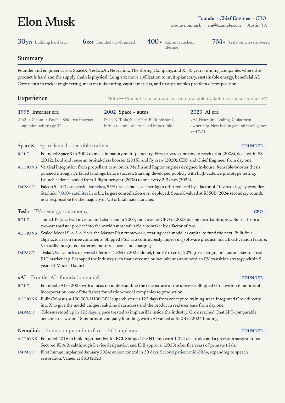
Resume
Founder CV, 2 pages
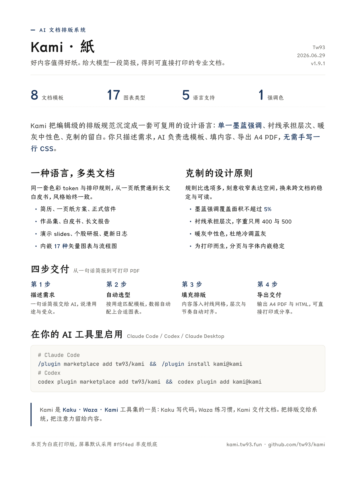
One-Pager
Kami intro, white-paper print, 1 page
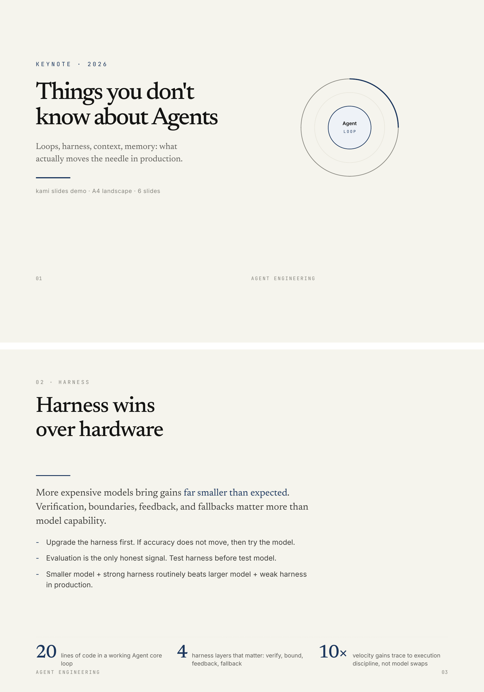
Slides
Agent keynote, 8 slides
Built with Kami
Three product sites built with the same landing-page template.
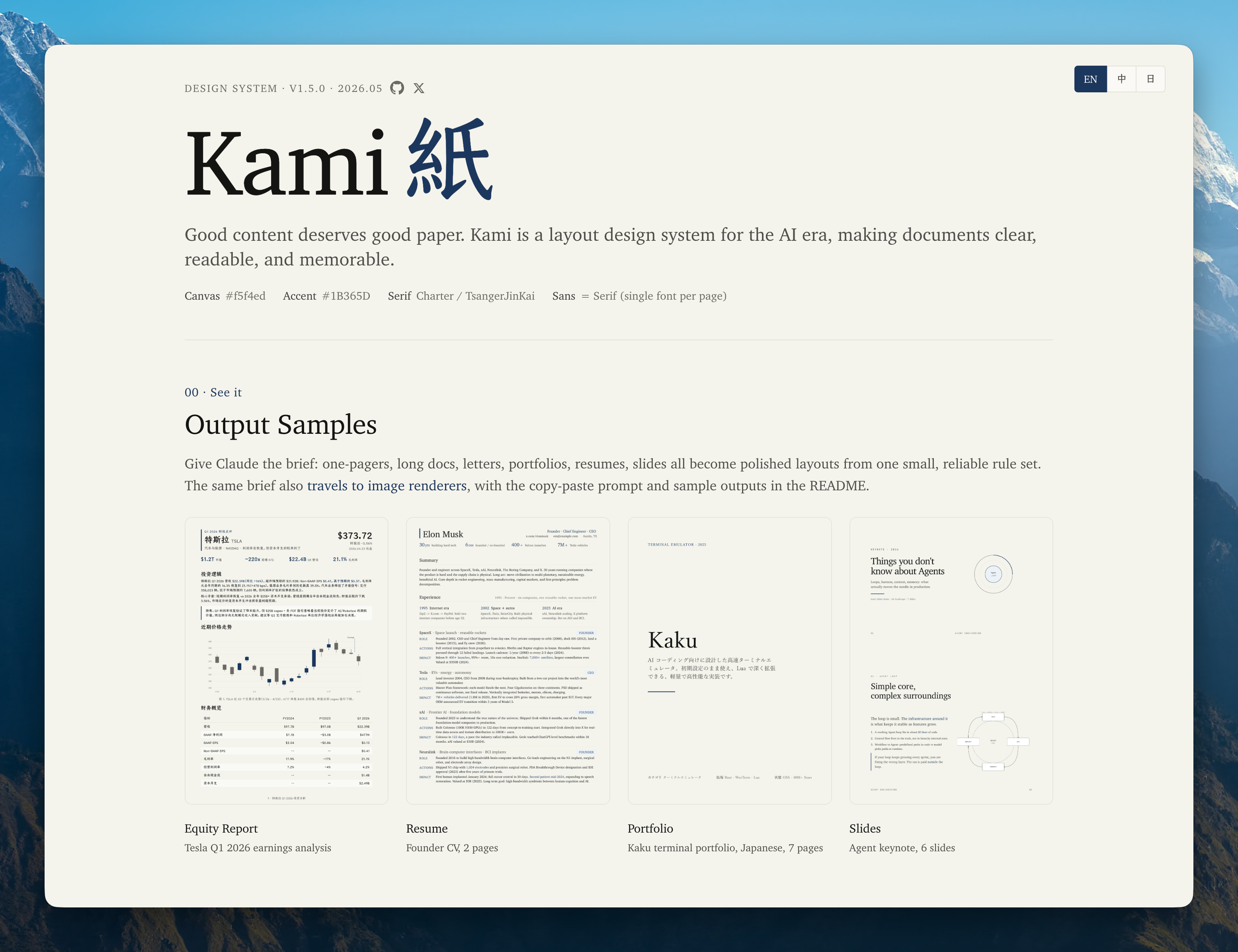
Kami
Design system homepage
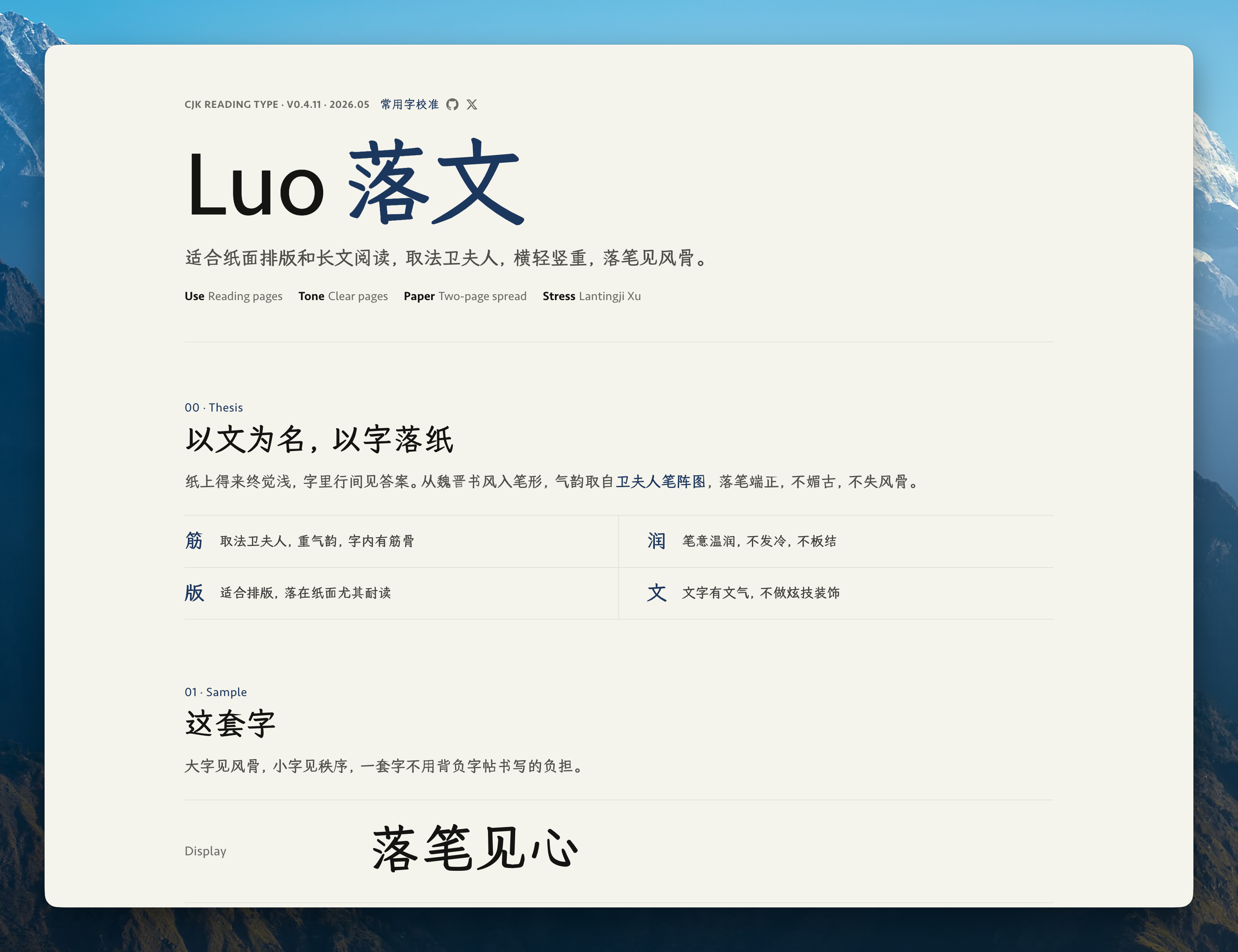
Luo
CJK reading font, Chinese
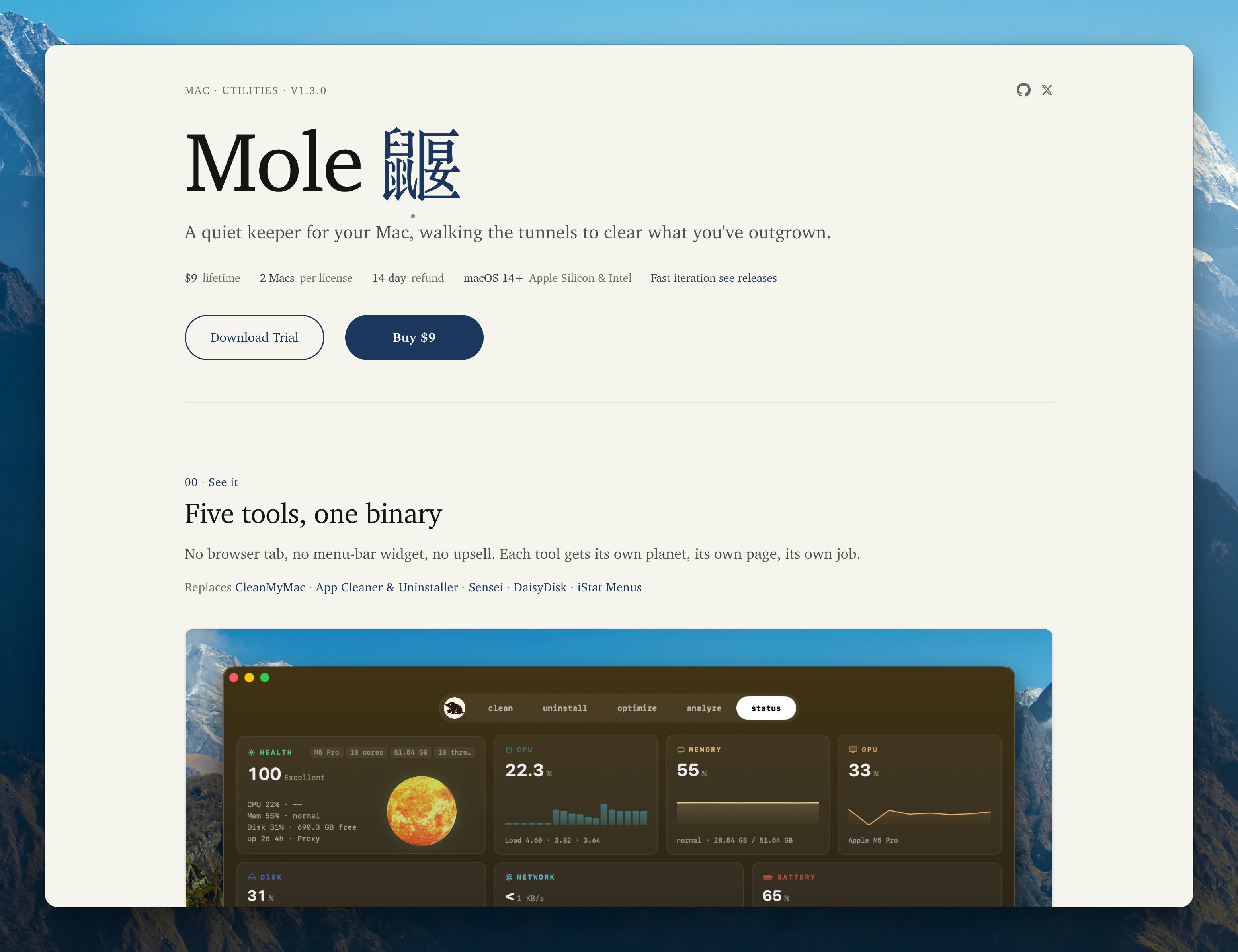
Mole
macOS system utility
Install & Invoke
Tell Claude what you need, for example "build me a resume", "make a one-pager for my startup", or "design a slide deck for my talk". The skill auto-triggers, no slash command needed.
# Claude Code, Codex, Cursor, and other agents
npx skills add tw93/kami -a claude-code codex cursor -g -y

# Claude Code plugin (v2.1.142+)
/plugin marketplace add tw93/kami
/plugin install kami@kami

# Codex plugin
codex plugin marketplace add tw93/kami
codex plugin add kami@kami

# Claude Desktop
Download kami.zip, then upload it in Customize > Skills > "+" > Create skill
FAQ
- What is Kami?
- Kami gives AI agents templates and layout rules for documents and landing pages. You can also use its visual instructions with image tools such as Claude Design or GPT Canvas.
- What can it produce?
- Kami includes eight document templates, a multilingual landing-page system, and 18 inline SVG diagram types. Documents export to PDF or PNG, and slides also have an editable PPTX path.
- Can Kami match my brand?
- Yes, share your brand colors, fonts, and layout preferences or provide a brand profile, and your brief will override Kami's defaults.
- What languages does it support?
- English and Chinese have the most complete support. Japanese and Korean use language-specific font fallbacks and layout adjustments, with each output checked before delivery. Default fonts are Charter, TsangerJinKai02, YuMincho, and Source Han Serif K, respectively.
Design Origins
I like investing in US equities and ask Claude to write research reports all the time. Every output landed in the same default-doc look: gray, flat, a different layout each session. The structure was hard to scan, the formatting felt dated, and nothing about the page made me want to keep reading. So I started fixing the typography, the palette, the spacing, one rule at a time, until the report became a page I actually enjoyed.
Later I needed to present "The Agent You Don't Know: Principles, Architecture and Engineering Practice." I already had the document and didn't want to build slides from scratch, so I used Claude Design to lay it out in my own style, tweaked it round after round, and eventually got it to a place I was happy with. That process added inline SVG charts, a unified warm palette, and a tighter editorial rhythm. It kept growing until it covered every document I regularly ship, so I collected the templates and rules into Kami.
Design Principles
The defaults are a warm parchment background, ink-blue accents, and serif fonts. Type size and spacing separate headings from body text. A white-background option supports printing, with warm fills retained in cards and tables.
- 1
Page background is parchment
#f5f4ed, except in the white-paper print variant - 2
Accent color is ink blue
#1B365Donly; no second chromatic hue - 3
All grays are warm, yellow-brown undertone; no cool blue-grays
- 4
One serif family carries headlines and body; add a distinct sans only for real UI chrome
- 5
Serif body at 400, headings at 500. Avoid synthetic bold
- 6
Three line-height bands: tight titles 1.1-1.3 / dense 1.4-1.45 / reading 1.5-1.55
- 7
Tag backgrounds must be solid hex; no rgba, WeasyPrint double-rectangle bug
- 8
Keep surfaces flat by default; reserve a faint shadow for real floating elements
Warm Restraint
Use one accent color and warm grays. Keep ink-blue accents within 5% of the page.
Canvas
Parchment
Default page background
#F5F4EDIvory
Cards / elevated surfaces
#FAF9F5Warm Sand
Button default / interactive surfaces
#E8E6DCDeep Dark
Dark theme page base, not pure black
#141413Brand
Ink Blue
Primary color · CTA · labels · section overline
#1B365DInk Light
Links on dark surfaces · lighter variant
#2D5A8ADark Surface
Dark theme container · warm charcoal
#30302EError
Error state, deep warm red
#B53333Warm Neutrals
Near Black
#141413Dark Warm
#3D3D3AOlive
#504e49Stone
#6b6a64Tag Tints
Use one of two registered solid tints. #EEF2F7 recedes; #E4ECF5 is the default. Solid hex avoids WeasyPrint's double-rectangle rendering bug.
Quiet
#EEF2F7Default
#E4ECF5Type System
Use one serif family for headings and body text, and a monospace font for code.
Aa
Serif · Headlines + Body
Charter / TsangerJinKai02
Used for headlines, body text, pull quotes, and numeric emphasis. English uses Charter, Chinese uses TsangerJinKai02.
</>
Mono · Code
JetBrains Mono
Code blocks, version numbers, hex values, tabular figures.
Scale (print pt; screen px = pt x 1.33)
documents
weight 500
line 1.10
weight 500
line 1.20
weight 500
line 1.25
weight 500
line 1.30
weight 400
line 1.55
weight 400
line 1.45
weight 600
line 1.35
Rhythm & Form
Base unit: 4pt. Denser layouts get smaller margins; more formal documents get larger ones.
| Scale | Value | Use | |
|---|---|---|---|
| xs | 2-3 pt | Inline elements | |
| sm | 4-5 pt | Tag padding · tight layout | |
| md | 8-10 pt | Component internals | |
| lg | 16-20 pt | Between components · card padding | |
| xl | 24-32 pt | Section title margins | |
| 2xl | 40-60 pt | Between major sections | |
| 3xl | 80-120 pt | Between long-doc chapters |
Radii
Depth
Flat is the default. Use whitespace, a subtle background fill, or one neutral hairline. Reserve a faint shadow for a real screenshot, popover, or other surface that actually floats.
Atomic Modules
Reusable components for common document layouts.
Buttons
fill + border · no shadow · 8px radius
Tags, two levels
solid hex · receded or default
Quote
olive text + italic · no side rule
A thousand no's for every yes, prefer clarity over decoration.
Metric
serif number + sans label · tabular-nums
Section Title
serif 500 · 15pt · size-led hierarchy, no decoration
Plain List
spacing carries rhythm · no marker
- Warm parchment, except in the white-paper print variant
- Ink blue accent, no second color
- Serif carries authority
Code Block
ivory bg + 4pt radius, no border
// warmth from restraint, not from color
canvas   = parchment; accent = ink_blue
palette  = warm_neutrals − cool_grays
document = serif × hierarchy + generous_space
beauty   = constraints × intention ÷ noise
Quiet Card
one ivory fill + 8px radius · no border or shadow
Tesla Company Profile · One-Pager
Single A4 page · 4 metric cards + 3 body sections + timeline
Inline Charts
Choose from 18 inline SVG diagram types for architecture, processes, and data. Ask Claude to add one using the document’s colors and fonts.
System components and connections, one focal node
Decision branches, yes/no paths, focal on success
Quarterly revenue comparison, gradient or single color
Revenue structure breakdown, supports 3-6 segments
Quick Reference
Use this table to choose a component for each task.
| Task | How |
|---|---|
| Large headline | serif 500, size by hierarchy, line-height 1.10-1.30 |
| Reading body | serif 400, 9.5-10 pt, line-height 1.55 |
| Emphasize a number | color: var(--brand), not bold |
| Separate two sections | Whitespace first; one 0.5pt neutral full-width hairline only when the boundary must be explicit |
| Quote someone | Olive text + italic or indentation; no side rule |
| Show code | Ivory bg + 4pt radius + mono font, no border |
| Primary vs secondary | Primary: brand fill + ivory text; Secondary: warm-sand + charcoal |
| Mark a special card | Use a stronger label or a subtle background fill; do not add an accent edge |
| Begin a section | Serif 500 · 15pt · size-led hierarchy, no decoration needed |
| Document cover | Single page, Display size + right-aligned author/date + generous whitespace |
| Show key figures | Baseline row, transparent, no container + serif number, ink blue + sans label |
What to Avoid
Exceptions are allowed, but the reason should be explicit.
Page canvas
NeverPure white #ffffff or cool gray #f3f4f6 as page background. It makes the page feel brittle and weakens the warm parchment character.
InsteadUse #f5f4ed parchment by default, except in the white-paper print variant, with @page background set to the same color to avoid white edges when printing.
Tag tints
Neverrgba(27,54,93,0.18) for tags. WeasyPrint renders padding and glyph areas at different opacity, creating double rectangles.
InsteadUse the registered default tag token #E4ECF5. The rendering stays clean and the color remains stable.
Synthetic bold
NeverHeadlines at font-weight: 600 or heavier synthetic bold. It blurs strokes and degrades typographic quality.
InsteadBody 400, headings 500 (real W05). For more presence, use size, spacing, or ink-blue text, never synthetic bold.
Shadows
NeverHard drop shadow 0 2px 8px rgba(0,0,0,0.3). Visually heavy and likely to print as dark blobs.
InsteadKeep the surface flat. Use whitespace, a subtle background fill, or a neutral hairline; reserve a faint shadow for real floating UI or screenshots.